Last Minute New Website Feedback - Mudgee Biscotti - Launching This Weekend

Hey guys,

Have been a long time member of the OzBargain community and thought to consult the brains trust here for our new website :)

We are launching our new Italian biscotti baking business this weekend at the local farmers market and online: Mudgee Biscotti Our Instagram

We still have some final tweaking to do on the site, so if you find anything that doesn't make sense please let me know!

Would love any feedback, specifically around:

  • what you like / dislike about the site?
  • what products would you like to see? (Maybe a limited edition flavour of biscotti?)
  • how easy is the site to use?
  • and especially… what sort of deals could we make for the OzBargain community if you love biscotti :)

If it helps, I'm using Woocommerce on a Wordpress site. I have a little bit of experience with this and have built it myself.

Really appreciate all your feedback in advance!

Thanks everyone :)

JC

Edit: Blown away by the comments already, thank you to everyone who took the time out to reply!
Edit 2: So glad I posted this, thank you all very much for your detailed responses! Making a nice long list of website changes to get to soon.
Edit 3: Did anyone have any thoughts or feedback on our instagram? Keen to hear if anyone has experience with using it for business.

Related Stores

Mudgee Biscotti
Mudgee Biscotti

Comments

  • +1

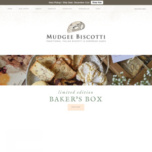
    Note I am viewing on mobile

    Need more information in the section of the site that you see when you first open it.

    • what is biscotti, how do you eat it (eg, "biscotti is a kind of biscuit developed in France in the early 1900s. It is delicious dipped in coffee, and perfect for parties, morning and afternoon teas, and gifts") (I have no idea if that's true, I'm sure you can come up with something much better)
    • where is your shop, what are the opening hours, where do you deliver
    • a few highlighted things for sale with link to see more, with pictures of it in packaging and outside packaging (should be attractive photos)
    • current special or coupon code if applicable

    At the moment the site is pretty to look at but if someone is only casually looking at it there's nothing attracting them to buy anything. You'd only buy something if you went there on purpose to buy some

    In the shop section:
    Need an add to cart button. And photos of it in packaging otherwise you don't really know what you are buying. And each section of product should be smaller so you can see more at once - makes it easier for people to decide what to buy if they can compare with others at the same time. Information on what you get is also missing. Eg "250g approx 10 pieces". The photos are pretty, but the artistic photos should show more how it is consumed. Eg a piece on a side plate next to a cup of coffee. The photos are beautiful but too artsy and don't really convey the information people need to make a decision to buy.

    And definitely this

    Asking to subscribe to your newsletter on every page is a turn off for me.

    There's very little screen real estate on a mobile page and it just means that you load a page and there's nothing relevant to you on it that you can see - might cause people to leave and not bother scrolling down

    • Wow thank you so much for this feedback - I've taken off the email signup on each page. Will keep coming back to this and adding in the other suggestions for sure!

      Thank you so much!

  • +4

    site looks very professional, easy to navigate!

    • +1

      I agree. I'd change the contact page form a bit. Maybe split it in half 2 columns / Text / Contact form, adjust the size of it.

      Search bar could be longer

      • Yes thank you for this, will take a look at the contact form… Thanks, appreciate it :)

    • Will look into this, thanks!

    • Glad to hear, thank you!

  • +6

    Can’t see the 50% off OzB code!

    • +2

      Haha! Well we really want to put something special together for OzBargain! Have saved (spent?) heaps!

  • +4

    Font too small. At the moment there's not much contrast between text and background.
    I like small fonts too but older colleagues always complain to me they can't read 💩.

    Asking to subscribe to your newsletter on almost every page that takes up one big row is a turn off for me.
    Maybe give it a dedicated page and put the link next to your Visit Our Shop button.
    If possible just ask for Email only. I always put dummy First/Last name: Tight Arse.

    The top banner background can be made clearer (more opaque) and may look better if used as overall background, not just the top.

    • Yep email signup form taken down - thank you for this suggestion. Will be coming back to this and adding in your suggestions here, thank you very much for the feedback :)

  • +4

    The About and Our Story content appears to be similar (if not the same?). Don’t need both, imo. It’s also a bit tl;dr. I’d either remove some photos or make them into small thumbnails because there is a ton of scrolling to be done before reaching the end, assuming the visitor even makes it that far.

    Info around delivery costs would be ideal, I hate doing dummy carts just to find out how much I’m up for on shipping.

    Recommend using analytics tools as well such as Google Analytics and Hotjar (their free level should suffice) ongoing to learn about who, when and how your visitors are engaging to your site. This will allow you to enhance and optimise the site over time.

    General look and feel is lovely and I agree with all the points/suggestions that have been made thus far by others.

    • Yes - the about section is more of a placeholder until I could get some content together :) thanks for this I will look into it.

      Delivery we're still sorting out and try to get on before having to checkout - tricky to post something light but somewhat bulky and keep the cost down, can't use a satchel bag so it will have to be boxed etc…

      Thanks for the suggestions with the analytics too that's great, and thank you for the feedback!

  • +1

    'Our Story' and 'About' seem to be pretty much the same page apart from an additional photo and sentence.

    Maybe you could combine the two?

    • Yep will look into that, thank you :)

  • +1

    Blocked by my works web filters as it's a new domain.

    • Registered it a few months ago - thanks for letting me know though appreciate it.

  • +2

    Totally agree with quantumcat's comments. I reckon if you implement those changes you'd find you have a better website.
    The photos on your about page are way too big. Fine if you're on a laptop/PC but on a mobile? Nope. Make them much smaller.

    I had a look at one product, the “Mudgee Medovik”. That blurb is waaay too much. Yeah sure it's nice to have some background to the product so maybe put it after the final paragraph - the one starting "Mudgee is a land flowing…".
    And based on that blurb it's refreshing to see a website using correct spelling, grammar and punctuation. Congrats!

    Just to compare prices I did a quick google to find other biscotti. Here a typical sample of your competition $6.50 for 400g.
    Bottom line - I think you're asking too much. I get that this link would be for product made in a commercial kitchen in commercial quantities so have more economies of scale, but nevertheless if you want this to be a goer - maybe $10 for 150g?
    https://www.nutgrocer.com.au/almond-biscotti-biscotti-di-man…

    I also notice just about each item I looked at says "out of stock". That to me says I won't get the item quickly and gives me the inclination to look elsewhere.

    • +2

      Probably "Out of Stock" as it is launching on the 21st.

      • +1

        You got it :)

    • +1

      Thank you for this! I will definitely look into resizing the pictures.

      Thank you for the feedback on the Mudgee Medovik too, I'll look into reworking it to make it present a bit nicer. What we're learning though is that people are loving the story behind the business and the making of the product so it's good to see that there is a balance to be found here.

      Re: pricing, will take your feedback on board for sure. We're launching this week at the market and our product and packaging is all handmade - hand rolled, stamped, labeled, sealed etc and looks very gifty. And like you said, there's a clear distinction to be made when it's factory vs artisan handmade.

      Here are some other pricing examples of handmade biscotti, so I think we're in the ballpark:

      120g for $14.95
      170g for $12.95
      125g for $10.50

  • +3

    It looks great! Just a few nit picking things. FYI feedback based on PC + Chrome

    • While the layout of the front page is great, the sizing could be altered as the top bar is just too small (e.g shop, our story etc.), especially the font size. And maybe a magnifying glass logo for the search bar to make to make it a bit more obvious.

    • Probably a stupid comment, but with the "By category" section on the homepage would you be able to choose another photo highlighting the actual product, as especially the cake image feels a bit cluttered.

    Apart from those really minor things it looks nice, and congratulations on the business.

    • +1

      Yeah I'm really going to have to figure out the font size issue - it's part of the theme so will have to investigate. Thank you.

      Great feedback on the biscotti and cake category pics, I am making a long list tonight :)

      Thank you very much!

  • +4

    First of all, congratulations for starting a business and I wish you all success in the future. My suggestions
    1) the top bar where you have the tabs 'shop' 'our story' etc - the fonts size needs to increase and have the colour changed. Currently very difficult to see and not stand out.
    2) add another tab called Q & A - for example some people might have allergies concern, they might want to know where the ingredients are sourced from, what oil or butter is used etc. Another big thing people like to ask is shipping. How much shipping cost ? How quick can people get the goods after order especially for people in other states.
    3) Love the honey cake, how many people is it for ? It would be great to show how many serves the cake is for. I think it is hard to get people order cakes all the time when it is nearly $100. I think it is better to do mini cakes or cup cake size so people can order more regularly rather than once a year kind of thing.
    4) add a gift idea section for special occasions like birthday, anniversary, farewell party, school party, Christmas and then in the photo shows the gift boxes and wrappings. Alternatively gift idea say under $20, under $30 or under $50
    5) Club member section which you can share how you can eat the biscuits with or recipes sharing or special club member discount or weekend cooking class

    You can also refer to these websites like Pukara Estate Olive Oil www.pukaraestate.com.au and KOI desert https://www.koidessertbar.com.au/dessert. Their websites are very well designed.

    Good luck with your website. I would be like to be your customers in the future.

    • +1

      +1 for the Q&A section

    • 1) That's on the list - thanks.
      2) Great suggestions! We will have to get some more content together for sure. Trying to get ready for the launch so this is great feedback we'll take on board.
      3) Yes we will add quantity - it's for 16 people and weighs about 2.3kg. Will look into minis, we made some to trial and they look very cute hehe.
      4) Thanks for the suggestions.
      5) Thanks for this too, great ideas with the special members club.

      Will check those other sites out too, appreciate your support!

  • +2

    Shipping info? That's probably my no.1 thing to want to know before I commit.

    • Yep this has been mentioned above thank you, will look at putting the shipping cost up front. Thanks!

  • +3

    Hi there,

    Congratulations on the new website.

    More than happy to share my 5 cents worth. I will number my points for some sort of order in my, at times, nonsensical ramblings.

    Number one, get the marketing right. A lot of products taking off emphasize health benefits - like fresh local ingredients, 100% Australian made, no preservatives, no artificial sweeteners or added sugar. Don't forget customers at your local farmers market would assume these have all these goodies but an online customer only knows what you tell them.

    Number two, if you plan on getting it on supermarket shelves never underestimate the power of packaging. There are all different designs, shapes and sizes but importantly it needs to make your product stand out from your competition.

    Number three, target audience, how many people buy Biscotti online? I would be guessing not many. This doesn't mean they won't buy your products online but you may need to have a more targeted product offering. For example, people on here love a cool & cheap gift near Christmas to take to someone's house. If you made a nice gift bag of different flavours, in some nice packaging, that would be an attractive buy to take over to someones house instead of a box of chocolates during xmas. More funky the flavours the better because the selling point is these are unique, can't buy anywhere else! Do a promotional price to get the brand out there. Don't price too high, even if you are just breaking even if you get a massive quantity out there you will get repeat business if the quality is there.

    Number four, i have seen products take off in your niche through cafes. Cafes often buy cakes from other suppliers as they are too hard to make. Biscotti they can buy fairly cheap if they even sell them - usually its a freebie with a coffee.I would suggest coming up with a show stopper chocolate mud/biscotti cake that gets your brand out there.

    Number five, always promote the story it is important in these type of businesses. I would suggest making it front and center but more concise. Move a little spill of your story closer to the top. Convey in the short passage that these are homemade for instance with nouna's secret recipe and only made with your local ingredients.

    Number six, With your website landing page is everything. But again who is your target audience, if you are running a google ad campaign for instance you can literally target exactly your audience and ensure your message is targeted towards them. Whether it be Christmas hampers etc.

    Lastly, don't be afraid to give your product out for free, just ask local shops, cafes, petrol stations if they would like to stock say 10 bags. Its a cheap form of advertising your product. Give them your card, price list and tell them to call you when they sell out and want to order some. Maybe you can even do little grab bags to make it attractive as an impulse purchase near cash registers etc.

    Best of luck! Wishing you the best with it all.

    • Thank you so much for the in depth reply! I am going to reread and reply after we package some more biscotti! :)

  • +1

    Looks good.

    Your wife saying "my gorgeous Joel" - her words?

    • they were hers… it was the other week though ;)

  • As someone who has/did/and will buy Biscotti, I liked the landing page in general, I would bring the photos of your products up near top. If I go to a page called something Biscotti I know what I want to see when I get there, yes Biscotti!
    Text darker and larger under products.
    Product size and delivery cost shown.

    • Thanks for this that's great, I do have the sliding banner up top but perhaps it's not quite cutting it.

      Will check the other suggestions, especially the font and delivery, thanks!

  • Think I got to every reply up to here, thanks again everyone for your feedback! Very helpful.

  • Hi, I'm a bit behind on my OzBargaining, but great website, looks super professional and has loads of great info. I hope you do really well.

    I'm using chrome mobile. A couple of things that weren't mentioned above:
    The white buttons on your homepage (shop, our story etc) aren't clickable buttons. They only work if you click the actual text inside the button. You should be able to edit your link so the whole white box is clickable.
    The orange buttons on other pages do work correctly.

    On the shop page it's unusual to see a price but no info on what you get for that, so I would expect to see 150g after the price or on the item name line without having to click to read more. Or, and in the future you may find this is a better idea, put 'from' price and them offer a choice of sizes so people can order small taster bags, or big family packages if they want more - maybe an idea for you to think about in the future depending on how things go.

    Also, think about a Christmas present bag or something aimed specifically at gifting and try to get some Christmas sales in. Push the handmade and packaging, put a bow and gift tag on it or offer it as a choice. Could also do a mix pack / taster pack for people who aren't sure - to persuade them to try it.

    Presumably you've thought about getting repeat customer purchases? People don't like being spammed, but think about a friendly follow up email a month after purchase saying we hope you've enjoyed them, we genuinely welcome your feedback (and from reading your post and each reply here I'm sure you do) and here's a 10% off code for reordering this week. PS feel free to share the code with friends or family!? (hopefully gets you some extra customers without you having to actually do anything!)

    When you start off you put in so much effort and it's hard and takes time to build things up. Don't miss any opportunities. Network with the other stall holders to see what they do. Print business cards or leaflets to swap so they can give your details out or recommend you, and do the same for them. Someone above said about giving some free to local shops and hope they realise they can sell them - as someone who has worked in small businesses I like that idea. If you have a local flower shop try to get in with them, I can see that working well as a gift to go with flowers.

    Re postage, try to make things according to auspost rules. EG if they charge under 250g, then under 500g, you don't want to be sending things that are 260g, so think of this when working your item weights plus packaging and change your pack sizes to 125g in future if needed to get under the post limits if needed. Same for dimensions, check auspost before ordering your packaging.

    Feel free to contact me if you need any further help. You've clearly put in a lot of work and deserve to do well. Best wishes.

    • Sorry I'm only just getting to this now, the last month has been so crazy busy - market was a total sellout! Didn't expect that response at all :) And we've picked up a few local stockists too which has kept us on our toes! Looking forward to some down time over the break to work on more of the feedback we've received here.

      Thanks so much for your feedback - I've put in those changes you mentioned about the weight of goods, that was a great idea. Going to try and work on the other things you've mentioned as well, this was a really insightful post thank you!

  • And as a thank you to all, our first exclusive deal for OzBargain is live here!

Login or Join to leave a comment